
The choices we make in our interior design have a profound impact on our psychological well-being. The colors we choose, the furniture we arrange, and the textures we introduce all contribute to the overall mood and atmosphere of a room. Wallpaper, with its unique ability to introduce pattern and color on a large scale, is a particularly powerful tool in this regard. The psychology of pattern is a fascinating field of study that explores how different visual motifs can influence our emotions, thoughts, and even our behavior.
This guide will delve into the psychology of pattern, providing you with the knowledge to choose a decor that not only enhances the beauty of your home but also supports your mental and emotional well-being.
The Language of Lines: The Power of Direction
The direction of lines in a pattern can have a significant impact on how we perceive a space. Vertical lines, for example, draw the eye upward, creating a sense of height, strength, and stability. This makes them an excellent choice for rooms with low ceilings or for creating a more formal and dignified atmosphere. Horizontal lines, on the other hand, create a sense of width, tranquility, and repose. They can make a narrow room feel more spacious and can contribute to a more relaxed and informal atmosphere.
Diagonal lines create a sense of movement, energy, and dynamism. They can be a great way to add a touch of excitement and playfulness to a room, but they should be used with care, as too many diagonal lines can create a sense of instability or restlessness. Curved lines, with their soft, flowing forms, create a sense of grace, elegance, and femininity. They can help to soften the hard edges of a room and create a more gentle and nurturing environment.
The Shape of Things: The Symbolism of Form
The shapes that make up a pattern also carry their own psychological associations. Circles, with their lack of beginning or end, are often associated with eternity, unity, and harmony. They can create a sense of community and connection, making them a good choice for living rooms and dining rooms. Squares and rectangles, with their straight lines and right angles, are associated with stability, reliability, and order. They can create a sense of security and trustworthiness, making them a good choice for home offices and other spaces where focus and concentration are desired.
Triangles, with their sharp angles and upward-pointing forms, are associated with energy, action, and direction. They can be a great way to add a sense of dynamism and excitement to a room, but they should be used in moderation, as too many triangles can create a sense of aggression or conflict. Organic shapes, with their irregular, free-flowing forms, are associated with nature, spontaneity, and creativity. They can help to create a more relaxed and informal atmosphere and can be a great way to bring the beauty of the natural world indoors.
The Power of Pattern: From Florals to Geometrics
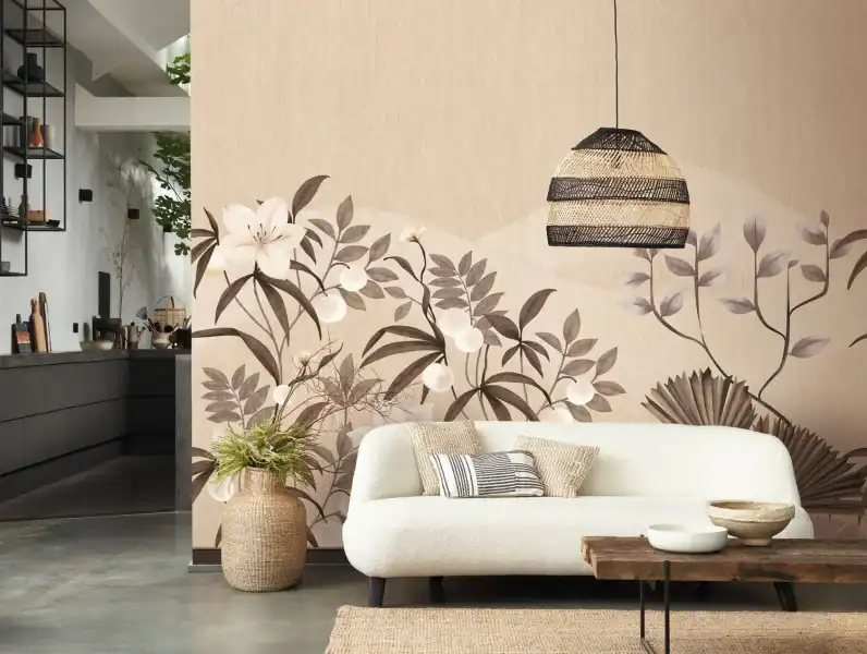
The overall style of a pattern also has a profound impact on our psychological response. Floral patterns, with their connection to the natural world, are often associated with beauty, femininity, and romance. They can create a sense of joy, optimism, and nostalgia, and can be a great way to bring a touch of the outdoors inside. The scale of a floral pattern can also influence its effect. Small-scale florals can create a sense of sweetness and charm, while large-scale florals can create a sense of drama and sophistication.
Geometric patterns, with their repeating shapes and mathematical precision, are often associated with order, logic, and modernity. They can create a sense of stability and control, and can be a great way to add a touch of sophistication and elegance to a room. The complexity of a geometric pattern can also influence its effect. Simple geometric patterns can create a sense of calm and order, while complex geometric patterns can create a sense of energy and excitement.
Abstract patterns, with their non-representational forms, are open to interpretation and can evoke a wide range of emotions. They can be a great way to add a touch of creativity and individuality to a room, and can be used to create a sense of energy, movement, or tranquility, depending on the specific forms and colors used.

The Science of Chromotherapy: Why Color Dictates Spatial Success
The color of a wallpaper is perhaps the most powerful factor in its psychological impact. Different colors can evoke a wide range of emotions, and the right color choice can have a significant impact on the mood and atmosphere of a room. The color of a wallcovering is more than an aesthetic choice; it is a physiological trigger. Through a process known as Chromotherapy, specific wavelengths of light reflected off a wallpaper’s surface interact with the human endocrine system, stimulating the production of hormones like melatonin for rest or serotonin for energy.
When we consult with designers, we emphasize that color choice is the foundation of Environmental Psychology. A room’s “chromatic temperature” can physically alter a person’s perception of the climate; for instance, “cool” blue tones can make a room feel up to 5 degrees cooler, whereas “warm” ochres and terracottas increase the sensation of warmth. This is a critical consideration for energy efficiency and seasonal comfort.
Furthermore, the Saturation and Value of a color determine the “visual weight” of a wall. High-saturation colors (bold, pure pigments) create an “active” wall that draws the eye and encourages movement, while low-saturation “muted” tones create a “passive” backdrop that recedes, allowing the mind to focus on tasks or rest.
Strategic Color Categorization by Psychological Goal
1. The Restorative Palette: Blues, Greens, and Soft Teals
The Impact: These colors are biologically linked to nature (the sky and water), which signals safety and stability to the brain.
Best For: Bedrooms, nurseries, and spa-like bathrooms.
Distributor Tip: Suggest “Dusty” or “Chalky” finishes to reduce light glare, further enhancing the calming effect.
2. The Cognitive Catalyst: Yellows, Ambers, and Warm Neutrals
The Impact: Yellow is the first color the human eye processes. It stimulates the left side of the brain, which is responsible for analytical thinking and logical clarity.
Best For: Home offices, study nooks, and dark hallways that need “artificial sunshine.”
Distributor Tip: Use these in “Matte” textures to prevent the color from becoming over-stimulating in high-light areas.
3. The Social Stimulant: Reds, Terracottas, and Deep Oranges
The Impact: These hues are known to increase heart rate and appetite. They create a sense of “hearth and home,” fostering conversation and communal warmth.
Best For: Dining rooms, kitchens, and formal entryways.
Distributor Tip: Because these colors are “advancing” (they make walls feel closer), they are perfect for making large, cavernous rooms feel intimate and “wrapped.”
4. The Authority Neutrals: Grays, Taupes, and Charcoals
The Impact: These provide “Visual Silence.” They represent sophistication and resilience, acting as a grounding force that allows furniture and art to take center stage.
Best For: Living rooms and professional reception areas.
Distributor Tip: To avoid a “cold” feeling, recommend “Greige” (a warm gray) or textured grasscloths that add depth to the neutral tone.
The Influence of Color: A Spectrum of Emotions
- Red
- A powerful and stimulating color that is associated with energy, passion, and excitement. It can be a great choice for dining rooms and other social spaces, as it can help to stimulate conversation and appetite. However, it should be used with care in bedrooms and other spaces where relaxation is desired, as it can be overstimulating.
- Blue
- A calming and serene color that is associated with tranquility, stability, and trust. It can be a great choice for bedrooms, bathrooms, and other spaces where a sense of peace and relaxation is desired.
- Green
- Refreshing and restorative color that is associated with nature, growth, and harmony. It can be a great choice for any room in the house, as it can help to create a sense of balance and well-being.
- Yellow
- A cheerful and optimistic color that is associated with happiness, creativity, and warmth. It can be a great choice for kitchens, breakfast nooks, and other spaces where a sense of energy and positivity is desired.
- Purple
- A rich and sophisticated color that is associated with luxury, creativity, and spirituality. It can be a great choice for bedrooms and other spaces where a sense of drama and elegance is desired.
- Neutral colors
- These include white, gray, and beige, versatile and timeless. They can create a sense of calm and sophistication, and can provide a neutral backdrop for furniture, artwork, and accessories.

Biophilic Design: The Healing Power of Nature
Biophilic design is a design philosophy that seeks to connect people with nature. It is based on the idea that humans have an innate need to connect with the natural world, and that doing so can have a positive impact on our mental and emotional well-being.
Wallpaper is a powerful tool in biophilic design, as it can be used to bring the patterns, colors, and textures of the natural world indoors. A wallpaper with a botanical print, a wood-grain texture, or a landscape mural can help to create a sense of calm and tranquility, reduce stress, and improve our overall sense of well-being.

Choosing Wallpaper for Different Room Functions
When choosing a wallpaper, it is important to consider the function of the room. In a bedroom, where the goal is to create a restful and relaxing environment, a wallpaper with a calming color and a soft, organic pattern may be the best choice. Selecting the ideal wallcovering requires a balance of aesthetic psychology and technical performance.
As a specialized distributor, we look beyond the pattern to evaluate how the substrate and “visual weight” of a design impact the functional utility of a space.
The Restful Sanctuary: Bedrooms and Low-Traffic Zones
In bedrooms, the objective is to lower cortisol levels through visual harmony. We recommend soft, organic patterns, such as biophilic leaf motifs or watercolor washes, in “receding” colors like sage, mist, and dusty blue. These tones physically appear further away, making a room feel more expansive and tranquil.
The Focus-Driven Workspace: Offices and Studios
For home offices, we prioritize “Low-Stimulus Geometry.” Simple, repetitive patterns—think subtle pinstripes or mid-century lattices—provide a structured backdrop that minimizes visual distraction. We suggest neutral palettes with a High Light Reflectance Value (LRV) to reduce eye strain during long hours of screen work.
High-Energy Creativity: Playrooms and Social Spaces
In playrooms, we transition from paper to high-performance non-woven or vinyl substrates. Here, the “Psychology of Play” is activated through bold scales and primary hues. We focus on “High-Action” patterns that encourage imaginative movement, ensuring the material is also “SureStrip” or scrubbable to handle the physical demands of the environment.
Technical Durability for High-Moisture Environments (Kitchens/Baths)
When selecting for bathrooms or kitchens, “pretty” isn’t enough—you need moisture-vapor permeability. We vet specific collections like York’s High-Performance Vinyls for these zones. Unlike standard paper, these are engineered to resist mildew and withstand the frequent temperature fluctuations of a shower or stovetop area without adhesive failure.
Acoustic Performance and Sound Dampening for Media Rooms
A common “content gap” on many sites is the failure to mention Acoustic Wallpaper. For home theaters or open-concept living rooms, we recommend heavy-weight grasscloths or flocked textiles. These materials increase the surface area of the wall, helping to absorb sound reflections and reduce “echo flutter,” creating a professional-grade auditory experience.
The Impact of Scale on Architectural Perception
Expert wallpaper selection involves manipulating the perceived size of a room. For narrow hallways or rooms with low ceilings, we advise using vertical stripes or “climbing” botanical prints to draw the eye upward. Conversely, large-scale murals in small powder rooms create a “jewel box” effect, a sophisticated designer tactic that uses high-contrast patterns to make small footprints feel intentional rather than cramped.
In a home office, where focus and concentration are desired, a wallpaper with a simple geometric pattern and a neutral color palette may be more appropriate. In a child’s playroom, where creativity and imagination are encouraged, a wallpaper with a bold, playful pattern and a vibrant color palette can be a great choice.
The psychology of pattern is a powerful tool that can be used to create a home that is not only beautiful but also supportive of your mental and emotional well-being.
By understanding the language of lines, the symbolism of form, and the influence of color, you can choose a wallpaper that will transform your space and enhance your life.