Ambiance Study
Jaune doux.
Lumière chaude, matins doux.
About this ambiance
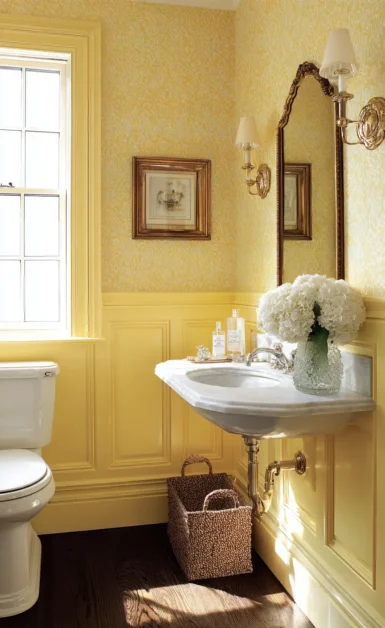
Des jaunes beurrés, délavés par le soleil, qui illuminent sans crier. Magnifique dans les pièces orientées au nord, les salles d'eau et les coins-déjeuner, associés à des blancs chauds et des fibres naturelles.
About soft yellow.
Soft yellow is the couleur of hospitality, breakfast light, and rooms that want to feel alive without becoming loud. Benjamin Moore describes yellow as a family that can range from golden ochre to pale buttercream, bringing warmth and optimism into intérieurs. That distinction is essential: the professional use of yellow is not about brightness alone, but about temperature, softness, and reflected light. I would anchor this story with Hawthorne Yellow HC-4, one of Benjamin Moore's classic balanced yellows, then support it with Yellow Lotus 2021-50 for fresher daylight rooms and Suntan Yellow 2155-50 when a muted, honeyed warmth is required. In intérieurs, soft yellow is at its best when it feels sun-washed rather than sugary.
Papier peint pairing should be approached with restraint. Yellow already has a natural radiance, so the papier peint must either filter that light or give it structure. Phillip Jeffries is excellent for this because a woven grasscloth, linen, or silk texture can temper yellow's brightness and make it feel artisanal. In a dining pièce painted Hawthorne Yellow HC-4, a natural-fiber paper with straw, raffia, or pale gold undertones can create the impression of late-afternoon light. This is especially effective with unlacquered brass, cream-painted trim, oak floors, and ceramics. The result is cheerful but mature.
Cole & Son should be used when soft yellow needs charm and narrative. Its archival and hand-drawn design language works beautifully with butter-yellow grounds, botanical trails, trellis motifs, or delicate florals. A Cole & Son floral with cream, green, and faded gold can turn a guest bedroom into a gentle garden pièce. The key is to avoid pairing yellow with patterns that are too childish or high-contrast unless the space is intentionally playful. For an elegant approach, combine Yellow Lotus 2021-50 walls with a papier peint that includes ivory, olive, ochre, or pale blue, allowing the yellow to connect to nature rather than novelty.
Eijffinger offers useful contemporary directions for yellow because its range includes on-trend intérieurs such as Nordic, warm, calm, murale, and linen-look themes. A pale yellow scheme with an Eijffinger linen-look or line-drawing papier peint can feel Scandinavian, optimistic, and uncluttered. Khrôma, by contrast, is appropriate when yellow should become more expressive. Its emphasis on elaborate couleur combinations and innovative structures makes it suitable for a bolder powder pièce, boutique retail environment, or creative office where Suntan Yellow 2155-50 might sit beside terracotta, tobacco, soft black, or mineral blue.
Thibaut is strongest for soft yellow when the architecture calls for tradition: stripes, checks, small-scale florals, and fresh grasscloths can keep yellow orderly. I often use soft yellow in kitchens, breakfast rooms, nurseries, stair halls, and north-facing bedrooms, but I avoid large expanses of glossy yellow because glare can cheapen the effect. Trim should usually be White Dove OC-17, Cloud White OC-130, or Simply White OC-117, all of which help yellow remain clean. The finished pièce should feel like slow mornings, linen curtains, warm ceramic lamps, and an atmosphere that welcomes people before a single word is spoken.
Paint Pairings
12 Benjamin Moore colours
A curated palette to coordinate trim, ceilings, and adjacent rooms with this ambiance.
HC-4
Hawthorne Yellow
188
Yellow Lotus
2155-50
Suntan Yellow
2154-50
Golden Straw
HC-7
Bryant Gold
2155-30
Yellow Squash
OC-89
Mannequin Cream
OC-103
Pale Moon
OC-104
Crisp Straw
918
Ylang Ylang
200
Waterbury Cream
OC-130
Cloud White
In this ambiance
Murales

York
Capri Murale papier peint- Bright
York Papier peint murale papier peint. Non-Woven. Unpasted. 3 panneaux | 75.75 in x 122.4 in.

York
Nastri Murale papier peint- Yellow
Missoni murale papier peint. Laminated Fibrous Non-Woven. Encollage du mur. 4 panneaux (35.4 in x 10.5 ft ea.) | 11.8-ft de large by 10.5-ft de haut une fois assemblé.

Khroma
Papier peint Panoramiques Sissinghurst Honey
Khroma Murale et Panoramique — Yellow.

Khroma
Papier peint Panoramiques Lei Gold
Khroma Murale et Panoramique — Yellow, Metallic.

Khroma
Papier peint Panoramiques Alocasia Night
Khroma Murale et Panoramique — green, yellow, pink.
In this ambiance
Papier Peint

Rifle Paper
Climbing Vines Papier peint - White & Metallic Gold
Climbing Vines is a design of delicate leaves growing in a botanical take on a vertical stripe, dotted with little white flowers. This papier peint is screen printed and comes in 27 inch rolls with a 24.25 inch repeat.

Rifle Paper
Aviary Peel & Stick Papier peint Sample - Metallic Gold & Cream
8 × 10” sample of our Aviary peel & stick papier peint. The intricate linework of the two-couleur Aviary print was originally created from a pen-and-ink drawing. Named for the birds perched on the winding branches, it also features poppy pods and blooming flowers. This peel & stick papier peint can

Rifle Paper
Amalfi Peel & Stick Papier peint Sample - Blush & Green
8 × 10” sample of our Amalfi peel & stick papier peint. Step into a grove of lemon trees bearing bright fruit and delicate blooms with our Amalfi motif, Inspiré de the famed Italian coastline. This peel & stick papier peint can easily be removed, making it perfect for rentals and accent walls.

Rifle Paper
Aviary Peel & Stick Papier peint Sample - Metallic Gold & Black
8 × 10” sample of our Aviary peel & stick papier peint. The intricate linework of the two-couleur Aviary print was originally created from a pen-and-ink drawing. Named for the birds perched on the winding branches, it also features poppy pods and blooming flowers. This peel & stick papier peint can

Rifle Paper
Fable Papier peint Sample - Metallic Gold
8 × 10” sample of our Fable papier peint. Our Fable print is Inspiré de classic tales, and features illustrated wood-block inspired woodland creatures among a forest of leaves and flowers.
Collections associées
Collections de papier peint associées
\n