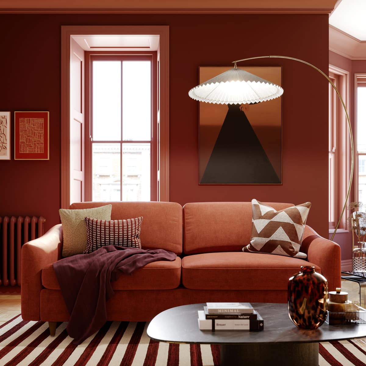
Ambiance Study
Terracotta chaleureux.
Ensoleillé, terreux, généreux.
About this ambiance
De l'argile méditerranéenne et de la brique réchauffée par le soleil — une couleur qui évoque la lumière de fin d'après-midi. À associer avec des blancs chaulés, du plâtre brut et du chêne non fini pour une ambiance Vieux Monde décontractée.
About warm terracotta.
Warm terracotta is one of the most humane colors in interior design. It speaks of clay, sunbaked walls, roof tile, desert earth, old brick, and the warmth of hand-formed matière. Benjamin Moore describes orange as ranging from earthy pumpkin tones to citrus hues, bringing energy and warmth to intérieurs. For this palette, the best references are Audubon Russet HC-51, Rustic Brick 2091-20, and Tawny Day Lily 2012-10. Audubon Russet HC-51 is historic and browned, suitable for dining rooms and entries. Rustic Brick 2091-20 is richer and more architectural. Tawny Day Lily 2012-10 is stronger, more spirited, and best reserved for accents, powder rooms, lacquered furniture, or small enveloping rooms.
Terracotta should never be treated as merely orange. It is more successful when understood as a warm earth neutral. This means it pairs beautifully with limewash textures, plaster, walnut, travertine, rattan, cream boucle, aged brass, olive green, indigo, and black iron. Papier peint can either reinforce the mineral quality or introduce a worldly decorative layer. Phillip Jeffries is the most natural match for refined terracotta because its natural, textured, and specialty papier peint can echo clay, grass, linen, and woven fibers. A cinnamon or raffia-toned grasscloth beside Audubon Russet millwork makes a pièce feel collected and tactile rather than painted flat.
Khrôma is also very strong for terracotta because the marque emphasizes elaborate couleur combinations, innovative structures, and collections rooted in cultural storytelling. Terracotta thrives in globally inspired intérieurs: Moroccan geometry, Mediterranean plaster effects, abstract clay murales, and sun-washed patterns with ochre, tobacco, blush, and indigo. Use Khrôma when the pièce needs personality and movement. Eijffinger can take the same palette into a lighter, more contemporary register through murales, linen looks, warm embrace themes, and sculptural clay references. In a modern dining nook, for instance, a soft murale with clay, beige, and charcoal could sit beside Rustic Brick 2091-20 chairs or painted shelving.
Cole & Son gives terracotta romance. Its scenic flora, hand-drawn motifs, and archival patterns are ideal when warm earth tones need English eccentricity or old-world charm. A terracotta floral with olive leaves and cream ground can be beautiful in a guest bedroom, while a deeper motif can make a powder pièce feel like a jewel box. Thibaut offers more tailored options through grasscloth, prints, stripes, and grounded naturals. A Thibaut natural papier peint with terracotta paint on the vanity or door creates warmth without overstatement.
Benjamin Moore recommends warm whites such as Simply White OC-117 and White Dove OC-17 with orange, as well as blue-gray contrast through Wedgewood Gray HC-146. This is excellent advice for terracotta: warm white keeps the pièce sunlit; blue-gray keeps it sophisticated. Avoid pairing terracotta with stark blue-white trim, which can make it appear harsh. Instead, let it live with ivory, sand, olive, navy, charcoal, and natural texture. A warm terracotta pièce should feel generous, grounded, and slightly Mediterranean, as though every object in it has been touched by the sun. If the pièce contains existing red oak, brick, or warm stone, terracotta should be sampled beside those fixed finishes first, because too much similar undertone can flatten the composition. A small note of green, blue-gray, or blackened bronze will usually restore balance.
Paint Pairings
12 Benjamin Moore colours
A curated palette to coordinate trim, ceilings, and adjacent rooms with this ambiance.
2173-30
Audubon Russet
2171-30
Rustic Brick
2172-30
Tawny Day Lily
AF-285
Tucson Coral
1203
Buttered Yam
HC-56
Chestertown Buff
1206
Soft Pumpkin
AF-280
Gilded Ballroom
1207
Windswept
HC-44
Lenox Tan
OC-83
Grand Teton White
OC-130
Cloud White
In this ambiance
Murales

York
Diamond Parquet Murale papier peint- Orange/Grey
York Papier peint murale papier peint. Non-Woven. Unpasted. 5 panneaux | 90 in x 108 in = 67.50 ft sq.

York
Garden Party Murale papier peint- Rose Multi
Rifle Paper Co. murale papier peint. Non-Woven. Unpasted. 5.5 ft x 11.2 ft | installs in 2 panneaux.

York
Garden Party Murale papier peint- Black Multi
Rifle Paper Co. murale papier peint. Non-Woven. Unpasted. 5.5 ft x 11.2 ft | installs in 2 panneaux.

Khroma
Papier peint Panoramiques Serpentine Rust
Khroma Murale et Panoramique — Red, Orange.

Khroma
Papier peint Panoramiques Palazzi Amber
Khroma Murale et Panoramique — Orange.
In this ambiance
Papier Peint

Rifle Paper
Bramble Papier peint - Rust
Inspiré de organic, abstract floral motifs of Art Nouveau textile designs, Bramble is a detailed print that incorporates iconic Rifle Paper Co. floral elements into a mirrored design. This papier peint is screen printed and comes in 27 inch rolls with a 25.25 inch repeat.

Rifle Paper
Aster Papier peint - Linen & Coral
Swirling stems and showy blooms pop on our large-scale Aster papier peint. This papier peint is screen printed and comes in 27 inch rolls with a 24.25 inch repeat.

Khroma
Papier peint Agathe Nefertiti Gold
Khroma Papier peint — orange, grey.

Khroma
Papier peint Agathe Hymen Imperial
Khroma Papier peint — blue, orange.

Khroma
Papier peint Havana Ramon Rust
Khroma Papier peint — terracotta, orange.
Collections associées
Collections de papier peint associées
\n